Showing posts with label art tips. Show all posts

Friday, January 25, 2019

Linked

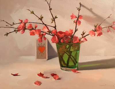
 "Linked" 
9 x 12 inches, oil on canvas

Underpainting to finish! I always begin my alla prima works with a tonal underpainting, which I then paint over immediately in color - not waiting for it to dry. Here's a short video of me talking more about it! 

Saturday, March 31, 2018

Green Shadow

green shadow, 8x10 inches, oil on canvas by sarah sedwick
 "Green Shadow"
8 x 10 inches, oil on canvas

I painted this alongside a lovely group of workshop students last weekend, walking them through the steps of planning a successful still life. Thumbnail sketch, Notan, 5-value study, underpainting, color! 

These steps are great tools  - I don't do them all, for every one of my paintings, of course. You loyal readers have seen many black and white studies from me, but over time, the other steps have become mental - I look through a viewfinder and try out different compositions in my head instead of doing thumbnail sketches. I think about the Notan, the overall light/dark effect I'm creating. Then I launch right into the value study.


The step I'm leaving out is really preliminary - setting up the still life! Always fun, always challenging. And that's the part that my students don't have to worry about when they're in a workshop with me! I take care of that. ;)

Monday, March 5, 2018

A New Painting of Some Oranges...With Videos!

"One Turned Away"
8 x 8 inches, oil on canvas
$250
Sold

This was the painting demonstration for my online art mentorship students at our monthly group session in Februray. It's a fun little piece! I love composing with cast shadows, and this is an excellent example of why. 

I just published a full-length video of this demo on YouTube - walking through my 3-step process for alla prima painting. Here's a clip!


(If you're reading this in your email - thanks for being a subscriber! You may need to click this link to watch, though. ;))

Thursday, March 1, 2018

Sorrow

"Sorrow (Three of Swords)" 14x18 oil on canvas by Sarah Sedwick
 "Sorrow (Three of Swords)" 
14 x 18 inches, oil on canvas
$600
Sold

I'm loving learning about Tarot by researching each card as I use them in my paintings. This one, the Three of Swords, when it's in the upright position, is kind of a bummer - but not entirely without sunshine. Yes, the card represents a painful episode in life, but pain can be seen as an opportunity to grow stronger, to change the direction of your life. While the pain may cloud your vision for a certain period, it will eventually allow you to see clearly and to put the past behind you. 

If you let them, the Swords cards can rid you of your denial and teach you valuable lessons.

...And if you paint them, they can teach you valuable lessons about color mixing and edges!
tarot card three of swords oil painting by sarah sedwick

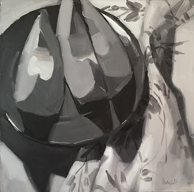
As always with a piece this large, I began with a black and white study. This one has already gone to a collector who saw it on Instagram, but you can see a lot more of these oil studies in my Etsy shop.


Black and white studies really help me plan my paintings - specifically, the way my big value shapes will affect the composition. What shape and gesture do the darkest darks make on the canvas? How dark are my cast shadows, really? And where is my area of strongest contrast? I keep the study close to me while I'm painting the color version, to remind myself of my intentions.

Thursday, August 25, 2016

Color Has Value

cantaloupe oil painting by sarah sedwick
"Cantaloupe Slices"
9 x 9 inches, oil on Arches oil paper
Sold

If there's one thing I say over and over again to my students, it's this: you can paint something any color you want, as long as you nail the value, it will work! 
The single most important element of realistic representational painting is value: how light or dark something is on the gray scale. And that's relative to everything else in the painting - so our goal as painters is to train our eyes to perceive that hierarchy of values. 

Sketching is great for this, but black and white oil studies are even better. You kill two birds with one stone, really - focusing on values, and also practicing your mixing and brushwork.

Tuesday, January 26, 2016

"White Object, Lemons" Still Life, Work-In-Progress, and Black-and-White Sketch!

 "White Object, Lemons"
12 x 24 inches, oil on canvas

It's been a while since I painted this little plate, let's see - can I find any examples from the past to show you? Yes!
It's hand-painted, which makes reproducing the design with my own hands so much more enjoyable. At one point I actually forgot I was painting on canvas. I felt like I was painting a plate myself! This twisting floral style is common to decorative pottery made in Jerusalem, where my mother bought it in 1979 - when she was pregnant with me! Can't say I remember much about the trip.

Here's a progression. I didn't tone the canvas for this one, instead letting the underpainting create its own tone. The color is a neutral orange I had left over on my palette - probably a mix of alizarin, cad yellow, cad red, ultramarine blue.....you know, all the primaries. As long as there's no white in the mix, it works.


...And my black and white sketch. I love love love making these. If you're going to use Arches oil paper, I recommend brushing a thin layer of Gamsol (or your OMS of choice) onto the surface before beginning. Although this does tend to make the finished product dry at a snail's pace, it helps with the absorbent/chalky feel of the surface I've heard myself some artists complain about.

"White Object, Lemons (sketch)"
8 x 11.5" oil on Arches oil paper

Monday, November 2, 2015

A New Series: Limited Palette Eggs

 
 "Shell Game"
8 x 8 inches, oil on canvas
Sold

I enjoyed this limited palette demo at my last workshop so much that I've decided to do a series based on it. This trio of colors is a strange choice for painting eggs since the yellow is so muted - and egg yolks are such a vivid, vibrant yellow - but the subtleties and harmonies are pleasing. And, as with all limited palettes, in the absence of anything "Yellower," Yellow Ocher does just fine!

My colors for this series: Ultramarine Blue, Yellow Ocher, and Alizarin Crimson - with Titanium White, of course!

The paint brand is M. Graham - my favorite.

Below is my underpainting. I put a wet tone on the canvas - with this limited palette, I use a red-orange, but any warm neutral orange (such as Burnt Sienna) works well - as long as there's no white added. Next, I sketch into my tone, pulling out the lights with a clean brush or rag and Gamsol, and deepening the darks by adding some red, purple, or blue to my toning orange. 

I think of the underpainting as the first two "stages" of my three-stage painting process. The first is layout, or drawing - the second is values - and the third, of course: color! I'll be discussing this and much, much more during my still life workshop at Winslow Art Center this weekend. There's still time to register, if you're interested!

Thursday, June 18, 2015

Mixing It Up


Last weekend was the second run of my new workshop "Mindful Mixing," at Oregon Art Supply here in Eugene. It's a still life based class, focusing on color and - you guessed it - mixing! I'm a huge fan of the palette knife, and spend a lot of time premixing paint colors before any of it goes on the canvas. 

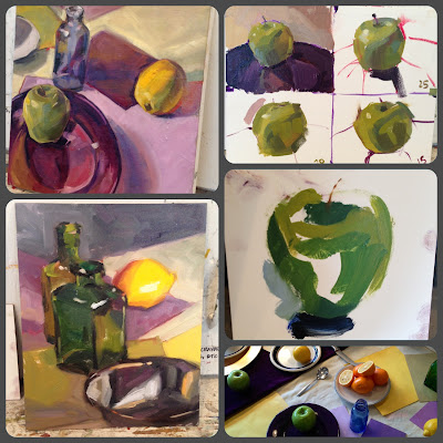
Above, you can see my demo of our "Stroke Economy" exercise. Paint an apple with 25 brushstrokes! Since a stroke is considered anything that happens between your brush touching the canvas and being lifted up, you can get a lot out of one. The trick is to get the right result from one!


Below are two more exercises. On the top left is a still life of all-white objects painted using black and white. Bottom left is the same still life painted using purple and yellow only - no white. On the right, you see my purple/yellow demo converted to black and white with a photo filter to check the values.  

Sunday, February 15, 2015

Primarily Apples

 "Apple Trio"
8 x 8 inches, oil on canvas

Here's a painting I did using only the primary colors (Cadmium red, Cadmium yellow, and Ultramarine blue), plus white. A great way to capture truly brilliant bright reds is to lighten them by adding yellow instead of white. Titanium white has a blue cast, which ever-so-slightly cools and dulls orangey Cad red. A dash of yellow lightens it, keeps it saturated, and gives it a warm kick that helps it advance towards the eye.

Here are the three stages of my painting. First, I tone the canvas with a dull orange I mix from all three colors, laying in my drawing and pulling out some highlights. Second, I firm up my drawing with a darker shade, indicating my darkest darks and noting the overall value scheme. And third: add color!

Step two-and-a-half - not shown here - is paint mixing. With a palette knife. A lot of it. :)


Tuesday, October 15, 2013

Tips and Tricks: It's Curtains!

 My contribution to this month's blog carnival, devoted to Tips and Tricks, is all about window treatments. It might sound a bit strange - this is an art blog and an art tips carnival, after all. Some of you, having witnessed firsthand my attempts at interior decoration, might be wondering what I could possibly contribute on the subject of tasteful decor curtains, but fear not! At the heart of this matter are two subjects I do know something about: problem solving the simple way, and shopping at the thrift store.
I've come to realize that people like to redecorate. They must, because there are tons of curtains at the thrift store. Weird curtains. Oh well, I don't judge. The more colorful, the better, for my purposes...


Those purposes include model backdrop, still life component, and (in moments of desperation), drop cloth. Hey, they're pretty cheap, these used curtains. 
One of my favorite ways to use any piece of fabric is to block out windows when I want to control a lighting situation. Our weather changes very quickly sometimes, and when I have a model in my studio, using window light, which can switch from cloudy grey to bright and sunny with no warning, is not a good option. Sun breaks make the general public happy, but for me, they are no good!
By putting two little nails in the wall, I can easily hang a window-blocker of any type with bulldog clips. Those round holes are so convenient.


If you score some of these funky grommet-curtains,  you can skip the clips altogether. I'm not sure how I feel about this type of curtain as an actual decorative element (although, it's already been established that I am no Martha Stewart), I love them for this:


I've got one more tidbit before I send you off on your carnival rounds. I get tons of questions about how I hang paintings in my studio, and the answer is simple:
 
Thanks for stopping by today! Hope you enjoy some more tips and tricks from these fabulous artists:

Linda Nickles


Marla Laubisch


Jo MacKenzie


Joanne Grant


Taryn Day

Friday, September 27, 2013

A Burning Question

 "Leaning Lanterns (sketch)"
approx. 8 x 10 inches, oil on board
Sold

I'm loving these Chinese Lanterns. They are, by far, the cream of my yard sale shopping crop this summer. I scored a TON of them, too.

I'll be blowing this little sketch up into a larger painting, but what size canvas to use if I want to keep the same proportions? Once again, the internet has the answer to my burning question, and here it is:


Hope you're having a great day!

Monday, April 29, 2013

I Paint Like a Different Person

"A Landscape on the Table"
8 x 10 inches, oil on canvas
$350

Mondays are teaching days in my world, and this particular lesson is a tough one: the 25-20-15 stroke exercise, followed by a longer, larger piece. It seems that every time I warm up this way, I paint like a different person. Sometimes you have to force yourself to think differently - the results can be dramatic! I noticed them in my students' work too.

Here's some of that work, along with my exercise in the upper right.

 (clockwise, from top left: Joy, Me, Francis, a snippet of our still life setup, and Katia)

Thursday, March 14, 2013

I Endorse the Scrape-Down, with Metaphors

  
"The Brown Beret"
8 x 10 inches, oil on canvas
$200

I love this model, Jessica, because she always picks great outfits. Today I felt like she was a character from a movie set in some bygone era. Not sure quite which, but even her facial expression was dripping nostalgia. And on this 8 x 10 inch canvas, I had to capture that expression using my signing brush. It has like four hairs. I don't usually do that, but when I do, I make sure to have an extra cup of coffee so my hands feel like they're shaking the whole time. (Art tips!)

Here's a shot after the first 45 minute sitting next to the finished piece. I lengthened the torso and completely repainted the legs somewhere in between these two. I also scraped the face before the last 45 minutes, hence no middle picture.
 
I never go back and mess with my older paintings. I'd rather throw them out and start from scratch. During the process of making a painting, though, you have to be willing to edit, delete, spell check, carpet bomb, and decapitate to get what you want.

Monday, February 25, 2013

Different Strokes

"Green Strokes"
8 x 8 inches, oil on canvas
Sold

Well, I did my homework. Instead of winging it with my workshop this week, I sat down last night to pre-test the exercise:
 Three ten minute paintings, progressively completed in 25, 20, and 15 strokes. Thanks to the oh-so-talented Carol Marine for inventing this one, and sharing it with me - it's a great way to eliminate "futzing," and discover what's really essential to convey form and texture.

 In class today, we started off with a "regular" 10 minute painting - kind of a control group. In this one I focused on blocking in the background values first, relying on that framework to help me round out the apple in space - and ran out of time. I also used my trusty #2 round brush - which you cannot use for the other three. A flat or filbert is a must. It's pretty crazy that the apple with the most solidly three-dimensional form is the 15 stroke sketch, eh?


My group, painting away: 


I'm really enjoying teaching this workshop, and just confirmed that I'll be doing it again in April. If you're interested in joining me for the next round of creativity calisthenics, contact Maude Kerns Art Center.

Saturday, February 23, 2013

The Palette That Limited Me

"Pale Citrus"
8 x 8 inches
oil on canvas
Sold

I love the gray that a mixture of Cerulean blue and Cadmium red make, so I decided to use them together in another limited palette experiment. I picked yellow ocher as the third primary, because I wanted to keep the red as the strongest influence, as I feel it was here.


Unfortunately, I had a beautiful bowl of clementines hanging out in my studio this week, just begging to be painted. And this palette of extremely muted oranges is what I brought to the task. 

I like the muted colors, and those special grays. I feel the limited palette helped me achieve color harmony. And I nailed the values, if I do say so myself: 


....but I might have done those juicy, glowing clementines a little more justice with some cadmium yellow in the mix!

Tuesday, February 12, 2013

An art lesson for the teacher: painting with complementary colors

"Orange and Blue" 
6 x 6"
oil on canvas
Sold

There's probably a rule of thumb for teachers that they should thoroughly test out any lesson they're planning to impose on those who've signed up for their class. Well, setting rules of thumb (and all common sense) aside, I didn't. Ok, ok, to be fair, I've done this one before! When I was 15 years old, but still. Preparation.
So, knowing *roughly* what was going to happen, I launched right into my demo, and once again found myself learning right along with my students. It blew my mind, actually: with only two tubes of paint and white, I mixed a palette, that, to my pigment-starved eye looked like an entire rainbow!
Click on the pictures below to see them bigger, and read my notes without a magnifying glass:


A closer look at my palette:
 

Then, blindly pretending that this was an all-day workshop instead of a three-hour class, I proceeded to suggest that we pick another color and add it into the mix, just to see what happened:

"The Power of Three" 
6 x 6"
oil on canvas
Sold

With the addition of Alizarin Crimson, my original complementary palette became a veritable rainbow. Just look at it:


If I seem a little excited, it's because I'm brimming with all the possibilities of limited palettes to try. When you call it "color theory," my soul shrivels a little (possibly remembering torture by color-aid, freshman year at MICA), but when it's just me and my palette knife - that is fun.

Friday, February 8, 2013

"Brown Eyes" oil painting original fine art portrait

8 x 10"
oil on canvas
Sold

The model for this painting is my gorgeous sister-in-law. She is blissfully ignorant that this painting even exists, as I took the reference photo years ago, during a previous phase of being big-time into portraiture. So, hi Jen! And thanks for posing way back when.

Whenever I'm painting a portrait, I try to keep in mind that different areas of the face have different color casts. I guess this happens because you have more blood vessels closer to the skin in your nose-and-cheek area, but if anyone has a better reason, please speak up! Sargent was a master at demonstrating this effect.


(Pulled from my "Art Lessons" board on Pinterest.)

....And here's another 15 minute warmup painting. I'm loving doing these lately, and have noticed a difference in my work overall as a result.

Saturday, February 2, 2013

45-30-15: Cardio for your painting hand!

9 x 6"
oil on paper
45 minutes

 6 x 6"
oil on canvas
30 minutes

5 x 5"
oil on canvas
15 minutes

Today I did a test run of a painting exercise I read about recently. It's pretty straightforward - three quick paintings, done in 45, 30, and 15 minute time increments. I cheated and made my surface smaller each time too. It's so interesting to see how the paintings loosen up as the times decrease. Although it's rough, the third, 15 minute painting is by far the most successful.

Do you think you'd enjoy doing an exercise like this? If you decide to try it, send me a link!