Wednesday, February 27, 2013

I Invent a Verb

"Sultry Sleepy Eyes"
8 x 10 inches, oil on canvas
$200

 I pulled into the parking lot of the Art Center last night still not knowing what I wanted to do, palette-wise. Because I'd been busy all morning, my travel palette was a mess, and with no time to clean it (between the 3 year old's dance class, making dinner, blogging, you know...), I threw a disposable palette in my paint box and ran out the door.

It seemed like as good a time as any to pull something out of the "I've been meaning to try" bag:

The Zorn Palette
Image source

  Red, Yellow Ocher, Black, White. That's it! So simple.
 And I'm going to declare my use of "Zorn" as a verb totally acceptable. I'll even give you permission to use it too.

Here's another Zorn spectrum. Great Zorning, dude!

image source

Tuesday, February 26, 2013

Someone took me up on it!

"Green Scarf, Green Eyes"
8 x 10 inches
oil on canvas
$350

Remember when I threw myself at you put out a call for portrait subjects a few weeks ago? And the crickets chirped very loudly? ...Well, someone finally took me up on my offer, and in lieu of wine (which I was more than willing to consider, nevermind that it was 9:30 am) all she demanded was a little online art-selling chat. As some of you know, there's not much I love to gush about more than Etsy --- Daily Paintworks being a close second. She got an earful. I got to hear all about her work in the Flemish masters' painting method and her continuing efforts to remove all petroleum products from her studio. AND I made my second painting of the week with "Green" in the title. 

It was a good day. Thanks, Sarah!
The talented Sarah Ciampa, with her portrait, by me. Also Sarah. Because it's the best name there is.

Monday, February 25, 2013

Different Strokes

"Green Strokes"
8 x 8 inches, oil on canvas
Sold

Well, I did my homework. Instead of winging it with my workshop this week, I sat down last night to pre-test the exercise:
 Three ten minute paintings, progressively completed in 25, 20, and 15 strokes. Thanks to the oh-so-talented Carol Marine for inventing this one, and sharing it with me - it's a great way to eliminate "futzing," and discover what's really essential to convey form and texture.

 In class today, we started off with a "regular" 10 minute painting - kind of a control group. In this one I focused on blocking in the background values first, relying on that framework to help me round out the apple in space - and ran out of time. I also used my trusty #2 round brush - which you cannot use for the other three. A flat or filbert is a must. It's pretty crazy that the apple with the most solidly three-dimensional form is the 15 stroke sketch, eh?


My group, painting away: 


I'm really enjoying teaching this workshop, and just confirmed that I'll be doing it again in April. If you're interested in joining me for the next round of creativity calisthenics, contact Maude Kerns Art Center.

Saturday, February 23, 2013

The Palette That Limited Me

"Pale Citrus"
8 x 8 inches
oil on canvas
Sold

I love the gray that a mixture of Cerulean blue and Cadmium red make, so I decided to use them together in another limited palette experiment. I picked yellow ocher as the third primary, because I wanted to keep the red as the strongest influence, as I feel it was here.


Unfortunately, I had a beautiful bowl of clementines hanging out in my studio this week, just begging to be painted. And this palette of extremely muted oranges is what I brought to the task. 

I like the muted colors, and those special grays. I feel the limited palette helped me achieve color harmony. And I nailed the values, if I do say so myself: 


....but I might have done those juicy, glowing clementines a little more justice with some cadmium yellow in the mix!

Friday, February 22, 2013

The Red and the Green

8 x 10"
oil on canvas
$350

Why 'The Red and the Green,' you ask? (Because let's face it, this looks more like 'The Orange and the Pink'). It was done using the same red-green-yellow ocher palette that I used for my last figure painting.  It also happens to be the title of a book by my favorite author, so it kind of sprang to mind.

Below is the sketch for this piece - 30 minutes.
 This weekend is looking pretty great: an art opening tonight (not for my work, but a show I'm excited to see), a very special portrait model in the morning, book club with the girls Saturday night, and maybe some more palette experimentation squeezed in too! I dug this old thing out of my bookcase the other day:

I think I got it when I was about eight. It's vintage.

What are your plans for the weekend?

Do you have a favorite author? Favorite book?

Is there a particular limited palette color combo I should try next?

Wednesday, February 20, 2013

Four lovely ladies....three wearing clothes.

"Green Miranda"
9 x 12 inches
oil on canvas
Sold


 I'm really enjoying experimenting with limited palettes lately. It's not like I was using a ton of colors before - and I'm sure I will go back to my normal palette at some point. Yesterday I laid out white, Cad red, a green mixed from Ultramarine blue and Cad yellow, and yellow ocher, and made a series of mixes and tints. These work very well as flesh tones - the only thing is that there's really no 'darkest-dark,' but I didn't miss it until I got to the eyes and hair.

Here's me checking my values about 2/3 of the way finished:
 

The best part of the night was being joined by two of my favorite artists - Carol and Gabriella! It's always fun to travel in packs. I'm thinking of dubbing us the Lady Artist Mafia of Eugene. Yep, L.A.M.E. (OK, maybe not.)

 
(image source)
8 x 8" oil on panel © Carol Marine

Carol's painting above and Gabriella's below:

16 x 20" oil on canvas, work-in-progress © Gabriella Soraci

Saturday, February 16, 2013

"In the Golden Circle"

  
8 x 8"
oil on canvas
$200

The other day, I did a 15 minute warmup painting that I enjoyed so much I decided to expand on it. The gold plate reflecting blue afternoon light is just so deliciously colorful. When painting gold, never forget to throw some green into the mix! Yellow Ochre + Ultramarine Blue make an excellent greeny gold.

15 minute warm-up, oil on paper coated with acrylic matte medium, approx 4x6"


It's been a good day. I started it off by running 6 miles with this lady, talking art (almost) the whole time, then painted until it was time to head to a birthday party with my daughter. And found out they were serving margaritas. Score!

Thursday, February 14, 2013

My Valentine's Date

 "The Pale Pink Dress" 
8 x 10"
oil on canvas
Sold

Below is my progress, from one to three hours. For some reason, I didn't take a "full-body" shot the first hour, but I was having problems with the legs at that point, so it was probably subconscious.

At the halfway point, I checked my values using a photo-editor on my phone. I find this extremely helpful and usually do it two or three times during a sitting. The app I have is called Camera+, but there are a ton out there that do the same thing.


 As I was organizing my thoughts before writing this post, it occurred to me that I spent last Valentine's Day painting this very same model! She's a total pro, and I've been lucky to paint her (ten million times.) Thank you, Miranda!


Wednesday, February 13, 2013

Two figure sketches in oil

"Forty-Five Minute Nude"
8 x 8"
oil on canvas
Sold

Surprising no one, I went to figure painting last night. Instead of attempting another in-depth depiction of this pose,  I did a couple of sketches. The first one took 90 minutes, the second 45. I tweaked both at home this morning.

"90 minute nude"
6 x 8"
oil on canvas
Sold
 
I'm nothing if not predictable in my painting-ways, though I prefer "consistent."


Tuesday, February 12, 2013

An art lesson for the teacher: painting with complementary colors

"Orange and Blue" 
6 x 6"
oil on canvas
Sold

There's probably a rule of thumb for teachers that they should thoroughly test out any lesson they're planning to impose on those who've signed up for their class. Well, setting rules of thumb (and all common sense) aside, I didn't. Ok, ok, to be fair, I've done this one before! When I was 15 years old, but still. Preparation.
So, knowing *roughly* what was going to happen, I launched right into my demo, and once again found myself learning right along with my students. It blew my mind, actually: with only two tubes of paint and white, I mixed a palette, that, to my pigment-starved eye looked like an entire rainbow!
Click on the pictures below to see them bigger, and read my notes without a magnifying glass:


A closer look at my palette:
 

Then, blindly pretending that this was an all-day workshop instead of a three-hour class, I proceeded to suggest that we pick another color and add it into the mix, just to see what happened:

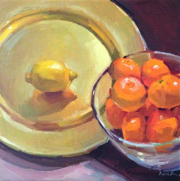
"The Power of Three" 
6 x 6"
oil on canvas
Sold

With the addition of Alizarin Crimson, my original complementary palette became a veritable rainbow. Just look at it:


If I seem a little excited, it's because I'm brimming with all the possibilities of limited palettes to try. When you call it "color theory," my soul shrivels a little (possibly remembering torture by color-aid, freshman year at MICA), but when it's just me and my palette knife - that is fun.

Friday, February 8, 2013

"Brown Eyes" oil painting original fine art portrait

8 x 10"
oil on canvas
Sold

The model for this painting is my gorgeous sister-in-law. She is blissfully ignorant that this painting even exists, as I took the reference photo years ago, during a previous phase of being big-time into portraiture. So, hi Jen! And thanks for posing way back when.

Whenever I'm painting a portrait, I try to keep in mind that different areas of the face have different color casts. I guess this happens because you have more blood vessels closer to the skin in your nose-and-cheek area, but if anyone has a better reason, please speak up! Sargent was a master at demonstrating this effect.


(Pulled from my "Art Lessons" board on Pinterest.)

....And here's another 15 minute warmup painting. I'm loving doing these lately, and have noticed a difference in my work overall as a result.

Thursday, February 7, 2013

"The Cloche Hat" original oil painting art portrait clothed model figure figurative

8 x 10"
oil on canvas
Sold

My second time painting this model. I was loving her retro-chic outfit, especially the wooly gray skirt. As you can see below, it was the first thing I painted.


A model break. Cool filter courtesy of Instagram.


Wednesday, February 6, 2013

"Orange Nude" female figure figurative oil painting from a live model

9 x 12"
oil on canvas
$250

Figure painting has been really rewarding for me lately, and the fact that my friend Gabriella has joined our Tuesday group is making me love it even more! Below is her painting, about half completed. I thought about not showing it to you - now you know about all the things I routinely leave out - but I figured you'd forgive me. What can I say? My nudes are in your face.

Untitled, work-in-progress by Gabriella Soraci. 16x20" oil on canvas
I love the way she paints the atmosphere of the room, instead of 'here's a sheet, here's some shelves, etc...' I can almost feel the air in there.

 Here's where I was at one, two, and three hours with the pose:
 

And here I am pretending to paint painting it! Secret blogger tip: get your friends to come to figure painting with you, then force them to take your picture. A lot. Because they love it.


Tuesday, February 5, 2013

My first crowd-sourced title, and an (awesome) palette infographic

"Orange in Hiding"
8 x 8"
oil on canvas
$200

Have I told you how much I love my new phone? I took every single picture in this post with my new iPhone 5. I can't believe how much more I'm able to share, having a good camera on my person at all times. It's incredible to me, and I hope you are enjoying it, too!

I discovered another huge perk of modern-photo-technology-slash-social-media today when I could not think of a title for this painting. I mean, come on: I put together all these excellent progress illustrations, I painted the darn thing - I've got to get creative with the title too?! I may be 50/50 when it comes to left vs. right brain, but my left side was out of the office today. Long story long, my Facebook crew hooked it up! "Orange in Hiding." Thanks!

The colors I began with. Click to see it bigger - I made a new palette out of plywood, which I have no idea if I like yet. When I make up my mind, I will do a full post about it. 

 A progression. The real take-away here is that I begin my drawing in paint using the same color I toned the canvas with, and as I get happier with the drawing I firm it up with progressively darker colors. Easier than erasing!

I'm running out to figure night....so, breathlessly, signing off!